
Your landing page is often the make-or-break point for potential customers. It's more than just an ad's destination — it's your chance to turn casual clicks into excited buyers or loyal leads.
But if it's cluttered, confusing, or boring, people will move on. But a well-designed landing page? That's everything for turning ad traffic into actual sales.
So, let’s get into the secrets of landing pages that convince and convert — just for dropshippers.
The Anatomy of a High-Converting Dropshipping Landing Page
Your landing page has a big job to do. It needs to grab a visitor's attention in seconds and convince them that your product is the solution to their problem. Also, make it easy to take the next step, whether that's buying or signing up for your email list.Take Pura Vida Bracelets, for instance. This popular brand knew they needed to boost conversions for their individual products and subscription boxes. Their solution was simple but effective — focused landing pages. 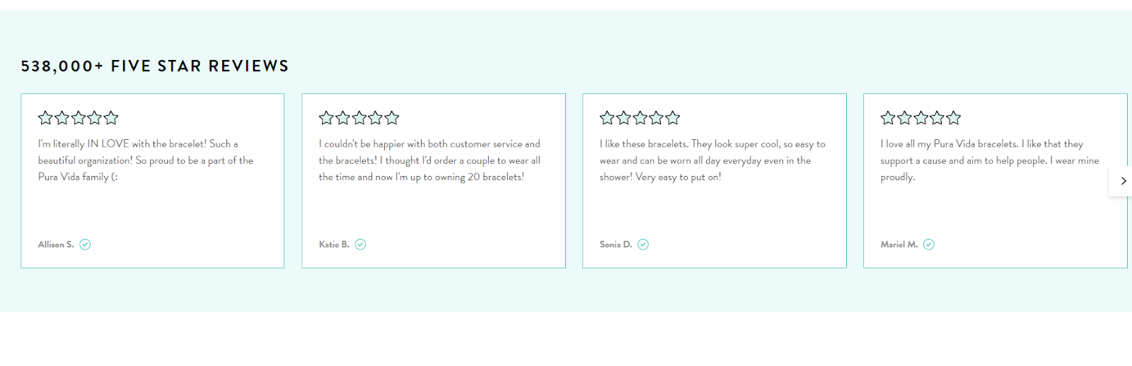
Image Source: Pura Vida Bracelets
Each page was tailored to a specific product or offer, with attention-grabbing headlines, vibrant product imagery, and concise copy that highlighted the benefits.
They leveraged social proof by incorporating customer testimonials and photos, and ensured there was only one call to action on each page to avoid confusion.
The result? Their targeted approach, with landing pages aligned with their ad campaigns, helped them attract the right audience and minimize distractions.
Let’s discuss the key elements that make it all work.
Headline
Your headline is like a billboard for your landing page. It needs to be bold, clear, and instantly communicate the main benefit your product offers. Avoid vague or generic statements. Instead, focus on solving a specific problem or addressing a strong desire, adds Alex Taylor, Head of Marketing at Digital Signage New York.Here's the difference.
- Weak headline: Comfortable Yoga Leggings
- Strong headline: End Workout Distractions with Leggings That Stay Put
High-Quality Image/Video
People process visuals way faster than text. Your image or video is a chance to make a strong emotional connection and showcase your product in its best light. Eran Mizrahi, CEO of Ingredient Brothers, shares, “If you're using an image, make sure it's high-quality and shows your product in use, ideally highlighting the benefits mentioned in your headline. Short, engaging videos can be even more powerful in demonstrating how your product works.”Compelling Copy
While visuals are important, your words still matter! Keep your landing page copy short, punchy, and to the point. Here's what to focus on.- Benefits over features: People buy because of how a product will make their life better, not just its technical specs.
- Address Pain Points: What problem does your product solve? Agitate that problem slightly, then position your product as the solution.
- Bullet Points Win: Break up your copy with easy-to-scan bullet points highlighting key benefits.
Social Proof
Testimonials, reviews, and star ratings, Company's business card are incredibly powerful. They show potential customers that others have tried your product and loved it. If you have them, feature short, impactful testimonials prominently on your landing page. Don't have many yet? Start actively asking customers for feedback!Single Call-to-Action (CTA)
Your CTA button is everything. Make it stand out with a contrasting color and place it above the fold (the part of the page visible without scrolling). Use strong action verbs like.- Shop Now
- Claim Your Discount
- Join the Waitlist
- Get Started Today
Opt-in Form
If your goal is lead generation, your form is crucial. Don't ask for a ton of information upfront — just the essentials like name and email. Let people know what they'll be getting in return for signing up (exclusive offers, a helpful download, etc).Strategies for Designing Effective Landing Pages
Here are key strategies for designing landing pages.Focus & Simplicity Win the Race
Less is often more. When a visitor lands on your page, you want them to immediately understand what you're offering and how it benefits them.
Chase Hughes, Founder of ProAI, shares, “A cluttered design, too much text, or multiple competing calls to action create confusion and lead to people bouncing away.”
Here's how to keep your landing page focused for maximum conversions.
Chase Hughes, Founder of ProAI, shares, “A cluttered design, too much text, or multiple competing calls to action create confusion and lead to people bouncing away.”
Here's how to keep your landing page focused for maximum conversions.
One Goal, One Page
Each landing page should have one primary objective. Do you want people to buy a specific product? Sign up for a free trial? Download a lead magnet? Resist the urge to cram multiple offers onto one page.For example, Bellroy wanted to increase sales for individual products within their collection.
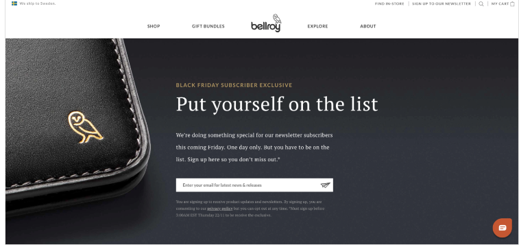
Image Source: Drip
Instead of relying on generic category pages, they created dedicated landing pages for each product, showcasing them with high-quality photos, highlighting their unique benefits, and adding social proof through customer reviews.
Clear pricing and a prominent "Add to Cart" button ensured there was no confusion about the next step. This strategy significantly boosted their conversion rates, proving the power of a single-minded approach to landing pages.
Clean and Uncluttered
Plenty of whitespace (blank areas) makes your page easier to scan. Use headings and subheadings to break up text. Stick to a simple color scheme that complements your branding without being distracting.Guide the Eye
The layout of your elements should naturally lead the visitor's eye towards your main headline, supporting visuals, and ultimately, your CTA button.Remove Unnecessary Navigation
Unlike a regular website page, your landing page shouldn't have a full menu with multiple links. While you might include a subtle link to your main store, the goal is to keep people focused on the task at hand.Martin Seeley, CEO of Mattress Next Day, adds, “Your landing page isn't the place to tell your entire brand story. It's a laser-focused sales tool. By keeping it simple and streamlined, you'll improve the visitor experience and dramatically increase your chances of getting that conversion.”
Mobile Optimization
A huge chunk of your potential customers will be viewing your landing page on a smartphone. If it looks messy, loads slowly, or has impossible-to-tap buttons on mobile, you're losing out on sales.Here's how to ensure your landing page delivers a seamless mobile experience and Google Ads for SaaS.
Make it Responsive
Your landing page builder (or the platform you use) should automatically adjust the layout for different screen sizes. Check this thoroughly on your own phone, tablet, and ask for feedback from others.Make it User- Friendly
Buttons need to be large enough to easily tap with a thumb. Links within your text should be very obvious.Prioritize Speed
Mobile users are impatient! Danny Jay, Marketing Director at SOLVED Consulting, explains, “Use tools like Google's PageSpeed Insights to analyze your page load time and get suggestions for improvement. Optimize your images and code whenever possible.”Test on Real Devices
Don't just rely on simulators. View your landing page on as many different smartphones and tablets as you can to catch any device-specific quirks.A poor mobile experience creates instant frustration. When it's easy and enjoyable for people to interact with your landing page on their phone, it translates to higher conversion rates, plain and simple.
Urgency & Scarcity
Adding elements of urgency and scarcity to your landing page can be a powerful motivator to get visitors to take action right now. But it's best to use these tactics in a way that feels genuine and not overly pushy. Here's how.Limited-Time Offers
A special discount or free shipping that expires within a specific time frame creates a sense of urgency. Display a countdown timer to emphasize the ticking clock.Low Stock = High Demand
If you have limited inventory of an item, prominently display this information on your landing page ("Only 5 left in stock!"). This taps into people's fear of missing out (FOMO).Social Proof Urgency
Phrases like "50 people bought this in the last 24 hours" aren't just numbers; they're a form of social proof. They create a sense of urgency and excitement, hinting that others are finding value in the product and that you might miss out if you don't act quickly.Kettle & Fire, a bone broth company, understood the power of social proof. They used it to boost email sign-ups by redesigning their landing page with a compelling offer (a free recipe ebook), prominent customer testimonials and media logos, a simplified sign-up form, and trust badges.
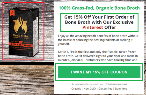
Image Source: Unbounce
This resulted in a 30% increase in their email list growth. It's a testament to how effective social proof can be when used strategically.
Exclusive Access
Offer early-bird access to a new product launch or a 'waitlist' signup to create a sense of exclusivity and anticipation.Don't fake scarcity or use misleading countdowns. This damages trust and can backfire in the long run. If your offer is genuinely time-sensitive or the quantity is limited, be upfront about it, adds Saba Mobebpour, CEO at DropGenius.
Trust & Reassurance
Before someone buys from you or shares their email address, they might have lingering doubts. It's your job to ease those doubts on your landing page! Here's how.Anticipate Concerns
Put yourself in your potential customer's shoes. What might they be worried about? Price? Shipping times? Product quality? Address these objections head-on within your copy, adds Noam Friedman, CMO of Tradeit.gg.Guarantees and Returns
Alison Lancaster, CEO of Pressat.co.uk, shares, “A clear and generous return policy shows you stand behind your product. If you offer a money-back guarantee, mention it prominently.”Security Seals
Display trust icons like "Secure Checkout" or payment processor logos (PayPal, Visa, etc.). This subtly reassures people that their financial information is safe.Reviews & Testimonials
We've discussed social proof before, but it's worth reiterating its importance. Seeing positive feedback from other customers is incredibly reassuring.Contact Info
It might seem minor, but including a way to contact you (even just an email address) shows that you're a real company ready to help if there are any issues, adds Sumeer Kaur, Founder of Lashkaraa.com.To Sum it Up
Your landing page isn't just an online flier — it's a great way that can make or break your dropshipping success. Remember, focus and simplicity win the day. Address your customer's needs, make it easy for them to act, and build trust every step of the way.Gerrid Smith, CMO of Joy Organics, shares, “Don't be afraid to experiment with different strategies and test how changes impact your results. By putting in the effort to optimize your landing pages, you'll attract more qualified leads and watch those conversions climb!”